WComps
wcomp is a simplified verion of the web components concept. Like block, wcomp has a set of files to specify its view and controller, and a wcomp can be instantiated multiple times on the same web page. Unlike block, wcomp is not pre-bound to any data model. In that sense, wcomps can be more flexible and more reusable than blocks.
Wcomps can be instantiated in the HTML template with the wcomp() function. This function can accept the following parameters:
- id : you can give an ID to an instantiated wcomp. If not, coServ will assign one to it. This parameter is optional.
- path : path name of a wcomp. This parameter is required.
- params : parameters supplied to the wcomp. This parameter is optional.
- options: Additional options to configure a wcomp. This parameter is optional.
A Bootstrap Example
Bootstrap is a popular CSS framework which has been widely used in many websites. As good as bootstrap is, you may still sometimes feel beat-up by the verbose HTML codes that have to be typed. Fortunately, this problem can be easily solved by wcomp. Let's show an example below. Assuming you need to create a bootstrap dropdowns, you can creat a dropdown wcomp like the following:
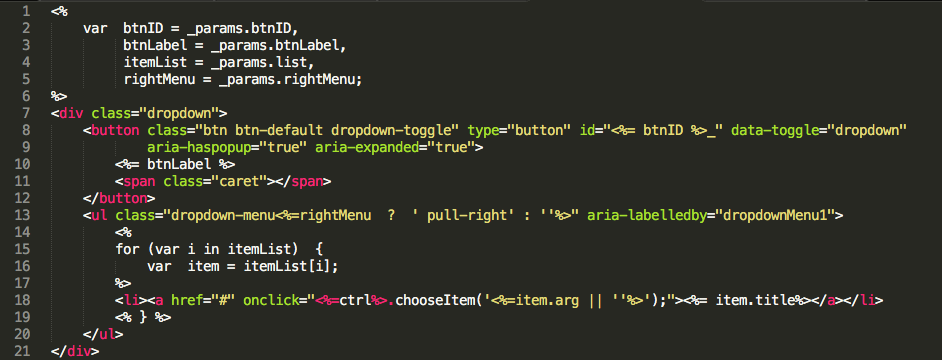
Without repeatly typing the verbose HTML codes, now you can have a dropdown by simply calling the '/bs/dropdown' wcomp (assuming the dropdown wcomp has a path of /bs/dropdown) :
<%
    var params = {
            btnLabel: 'Choose something',
            itemList: [
                {title: 'Apple'},
                {titlle: 'Banana'}
            ]
        };

    wcomp('/bs/dropdown', params);
%>
Interact with a wcomp
Sometimes you may want to interact with a wcomp to change its title or calling its functions, etc. To interact with a wcomp, you'll have to do the following:
- In the wcomp HTML template, add an "id" attribute to the outer most tag and give its id value. Using the dropdown example shown above, you should change line #7 to: <div id="<%= ctx.id %>" class="dropdown">. Note that <%= ctx.id %> will have coServ to fill in the actual "id" value of the wcomp.
- From the HTML template to invoke a wcomp, remember to add the "id" parameter to the wcomp() function call. For example, <% wcomp('the_id', '/bs/dropdown', params); %>
- Finally to interact with a wcomp, you should first get its controller using the _wf.getCtrl() function and then use the controller to do what ever you want.
A simple example can make this clear. Assuming you have a block B to invoke a wcomp C. You can do the following in B's HTML template:
<% wcomp('ddBtn_id', '/bs/dropdown', params); %>
To interact with the drop-down button, you can do the following in B's controller (Javascript code):
var  ddCtrl = _wf.getCtrl('ddBtn_id');
ddCtrl.chooseItem('item one');
The above sample code will try to call the chooseItem() function of a wcomp instantiated with a 'ddBtn_id' ID.
Display without a wrapper
By default, coServ will add a <div> wrapper around a wcomp so coServ can assign an ID to the wcomp and provide CSS encapsulation to it. However, this may sometimes cause layout problems if you're using some CSS or UI libraries which would not expect such an additional wrapper. To solve the problem, you can ask coServ not to add an additional wrapper by specifying the "noWrapper" option:
<%
    wcomp('wcomp_id', 'wcomp_path', params,
          {noWrapper: true});
%>
Also, you may want to specify ID to the outer most tag of your wcomp so coServ can still offer CSS encapsulation to your component:
<div id="<%=ctx.id%>" ....